Convex
My Role
Senior Designer
The Team
Myself
Product Owner
Duration
3+ months
Overview
Convex offered a product tailored for commercial service businesses, providing data, insights, and applications to enhance sales performance. Their web application, Atlas, integrated property mapping with user-friendly tools to help sales teams identify high-potential prospects, streamline outreach, and boost revenue growth. By consolidating disparate data sources and offering a property-centric perspective, Convex enabled teams to efficiently plan, target, and engage with opportunities, optimizing their sales processes.
The Problem
At Convex, the app’s design centered around the concept of narrow panels that users could open to interact with specific pieces of information. These panels included property details, contact details, and company location details. When I joined the team, the design only allowed one of each type of panel to be open at a time. For example, if a user opened a panel for a specific property and then clicked on another property listed in the background table, the second action would replace the existing panel with the new one. This behavior made it impossible to view or compare details between two properties simultaneously. The same limitation applied to contact and company location panels—users could not view the details of two contacts or two locations side by side.
Getting Started
I was tasked with designing a new concept for how panels could behave in the app, with a focus on addressing the limitations of the existing system. The original design restricted users to opening only one panel of each type at a time and constrained all content to narrow side panels, which limited usability and made comparison difficult. My concept reimagined the experience by allowing users to open multiple panels of the same type simultaneously and introduced the idea of “stacking” panels like pages of a book. This approach let users dive deeper into layers of information—such as exploring a contact linked to a property, and then viewing related company data—without losing their place. To keep navigation fluid, I also introduced a way to quickly close all open panels and return to the original context, typically a table of search results or a map of local properties targeted for sales opportunities.
Workflow
My concept centered on the idea of the user diving deeper into information about an “object,” such as a property or contact, through a layered panel experience. The journey would typically begin on a page like the search results, where the user could click on a property they were interested in. This action would open the first panel containing the property’s details. From there, users could continue exploring related information—such as contacts associated with the property or nearby company locations—by opening additional panels. Each new panel would stack on top of the previous one, creating a natural, progressive flow of exploration without forcing users to leave their original context.
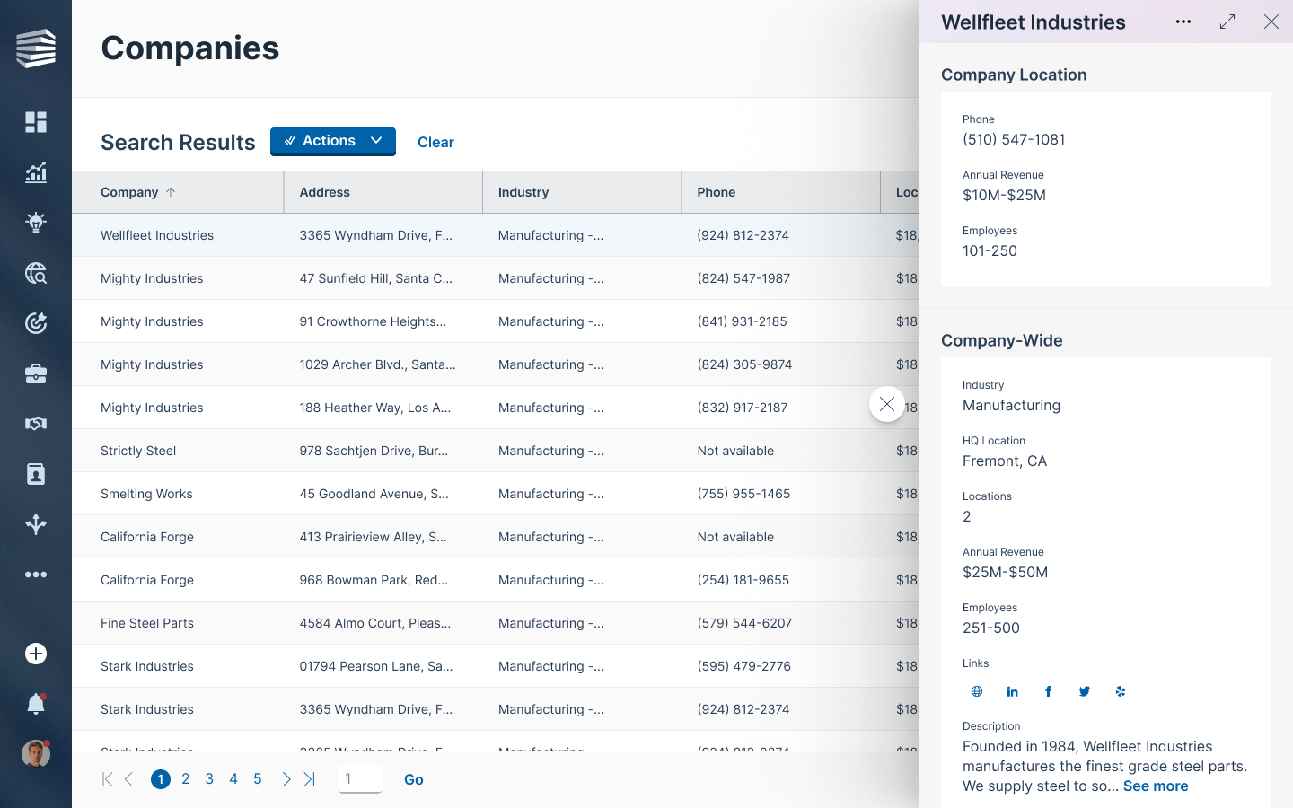
In this example, the user is first viewing details about a specific company location.
Next, they click on the property where the company is located, and view details about both the company and the property together.
From here, the user wants to explore all the contacts associated with the property. In this example, Building 90 includes contacts from three different companies, totaling 52 individuals. Since the contact list is too large to fit comfortably in a narrow panel, a large panel takes over the screen to display the full table with detailed information about each contact. The first two panels—showing the property details and company associations—remain open in the background and can be easily returned to by closing the contact table using the X in the upper-right corner. If the user wants to exit entirely and go back to their search results, they can click the floating circle with the X to close all open panels at once.
The next step in this flow is for the user to view details about a contact. They can click on the name of a contact and open the contact details in a narrow panel, which appears on top of the larger panel. All the panels they’ve opened so far are still open in the app, even if they’re hidden behind the large panel.
The final stage of this flow allows for the user to open up to 3 narrow panels side by side. These could be any combination of contact, company, or property detail panels.
Success
My concept directly addressed the limitations of the original panel system by allowing users to open multiple panels of the same type at once—enabling side-by-side comparisons and a more fluid exploration of related information. To prevent performance issues that could arise from opening too many panels simultaneously, I introduced a safeguard: when a user approached a set limit of open panels, they would receive a notification encouraging them to close some before continuing. This struck a balance between flexibility and performance, giving users the freedom to explore deeply without compromising the app’s responsiveness. Overall, the concept provided a thoughtful solution to the original design constraints while enhancing the user experience.


